Background
I was the teen in high school who was always sleep deprived in class, and I knew this was not how school should be. After reading all of the benefits that schools reaped when pushing their start times, I wondered why more schools didn't adopt the new timings. For my design capstone class, I decided to work on something I was passionate about: the strong connection between education and sleep.
Team
I worked on this project alone, under the guidance of my professor Brockett Horne.
Challenges
People are not getting enough sleep, now more than ever. The sleep deprivation epidemic has a much more detrimental effect on health and well- being than many are aware of, and it disproportionately affects teens. The Snooze Campaign aims to resolve this problem by promoting good sleep hygiene and later school start times to give students more time to rest. While similar campaigns exist, they lack engaging visual design and struggle to resonate with teens. Through accessible and comprehensive design, The Snooze Campaign spreads the message effectively.
What I Accomplished
The booklet is a comprehensive guide of the benefits of sleep, and is easily distributable through schools.
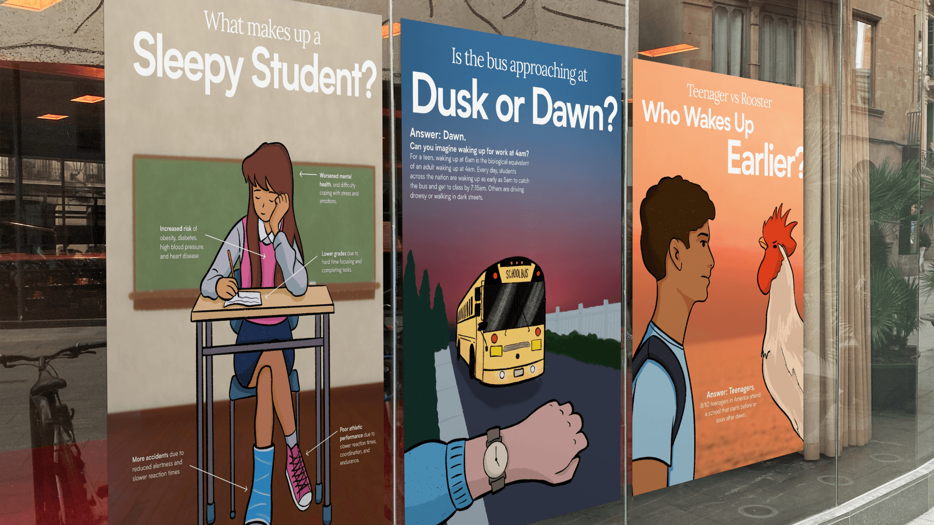
The eye-catching posters will be hung in classrooms to serve as a reminder for students to prioritize their sleep.
The merchandise: a postcard, stickers, and journal, allows people to support and share the message of the campaign.
By making these resources accessible and appealing, I hope to create a surge of advocacy for better sleep habits among young people. Teachers, health educators, and parents all play a role in creating a culture that values and celebrates sleep.
01 Research
Preliminary 'How Might We' Questions
Raise awareness among teens and parents about the negative effects of early school start times on sleep and overall health
Convince school administrators to adopt later start times for high school students
Create a student-led advocacy movement to push for later school start times
Address concerns around transportation and after-school activities in advocating for later school start times
Work with local lawmakers to pass legislation mandating later school start times for high school students
Celebrate and promote schools that prioritize student well- being through later start times and other sleep-friendly policies
Cause policy change in school start times to allow teenagers to prioritize their sleep thus improving their mental and physical health
Encourage the understanding that healthy sleep habits enhance the mental and physical well-being of teenagers
Why We Sleep
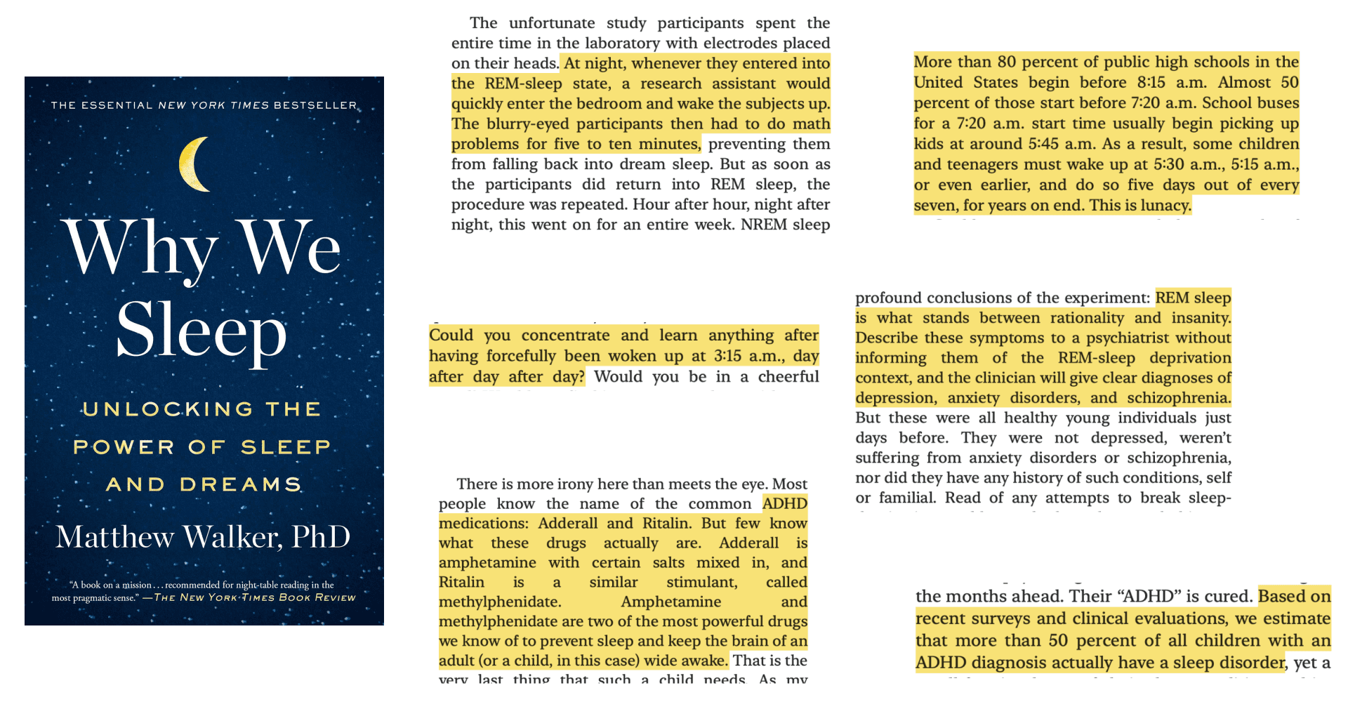
This was the book that partially inspired me to do this project, and it’s full of so much amazing research around sleep. It’s written by Matthew Walker, an English scientist and the director of the Center for Human Sleep Science at the University of California, Berkeley, who specializes in neuroscience and psychology. As I read the book, I began highlighting points that stood out to me or that I knew I would be able to visualize with my designs. Below are some of the chapters in the book that I went back to many times to gather data.
2. Caffeine, jet lag, melatonin
5. Change in sleep across lifespan
6. Benefits of sleep for the brain
7. Sleep deprivation and the brain
8. Cancer, heart attacks, and a shorter life
13. What’s stopping you from sleeping?
14. Hurting and helping your sleep (pills vs. therapy)
15. Sleep and society: what medicine and education are doing wrong, what google and nasa are doing right.
16. A new vision for sleep in the 21st century
Start School Later
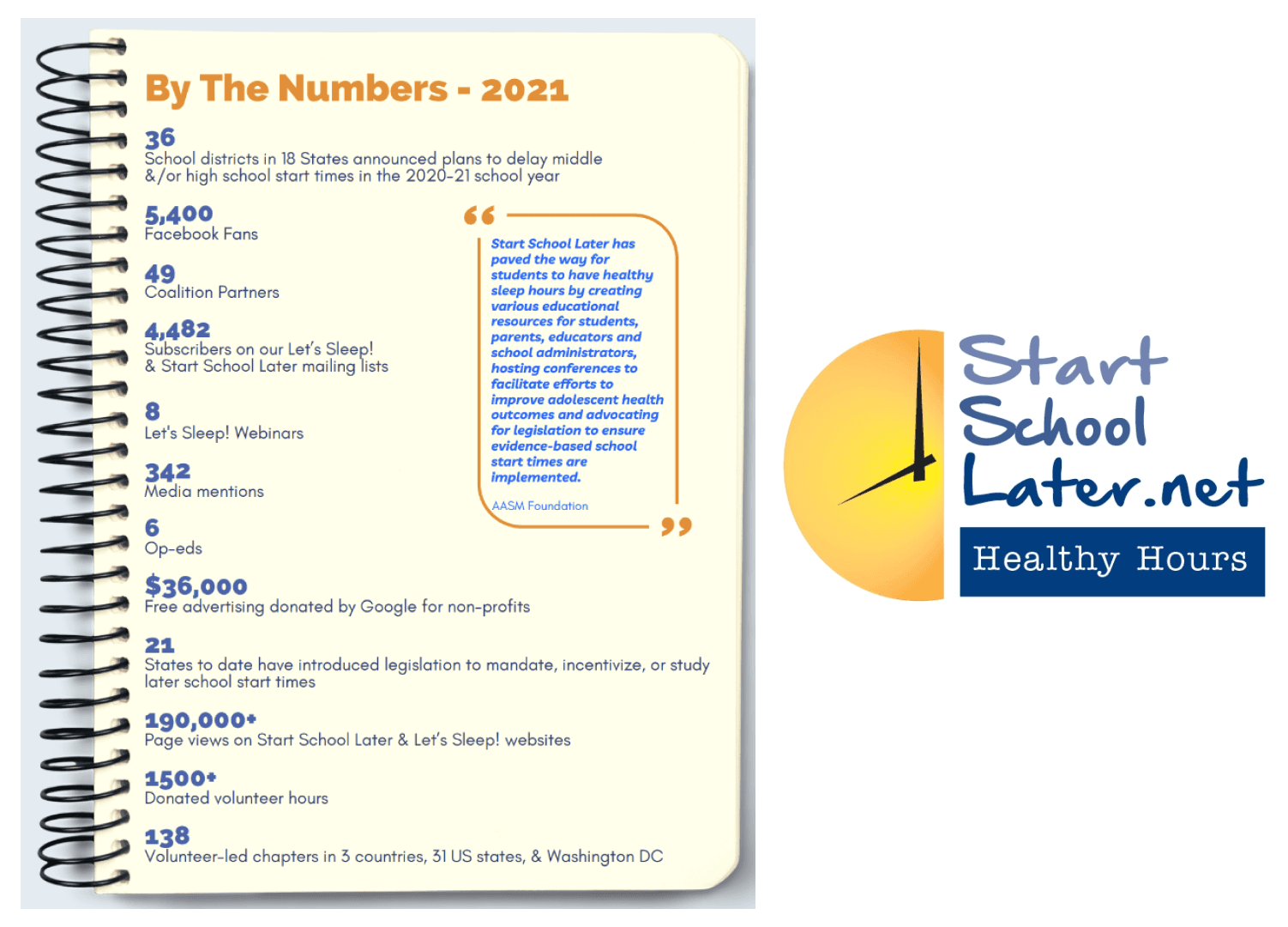
Start School Later, aka Healthy Hours, is a non-profit organization in the United States. Founded in 2011. Their campaign goals are similar to mine, so I found myself looking for stats and facts on their website. I also met with a woman on the board of the campaign to discuss what she finds is effective in campaigning for later start times, in terms of posters and materials. This helped guide my design process and understand more clearly what I would create.
02 Define
Still Life
Creating a still life with all the objects that remind me of sleep was helpful in starting to think creatively about my project and all the different directions it could go in.
HOURGLASS - The hourglass represents how little time people spend sleeping, but also that it's just a matter of time before the effects of constant sleep deprivation catch up to us and become irreversible.
- ENERGY DRINK AND BLANKET - I thought this ad from IKEA was simple yet powerful. People try to combat their tiredness with an energy drink, when the best cure is just sleeping.
- EARTH - The lights on the earth at night represent light pollution. I could research more the effects of light on sleep, such as night lights, blackout curtains, sleeping during the day, etc.
- TEEN - The teen represents the lack of sleep that a lot of people in the age group are getting. I could research further the correlation between sleep and academic performance in teenagers.
- ALARM CLOCK - A lot of people wake up by an alarm clock, but this is also a nod to the body’s internal clock and the times that we naturally want to sleep/wake vs the times that we do for school or work.
- MOON PHASES - The moon cycle subtly represents the sleep cycle and the different phases of sleep we are in, like REM. I’d like to study further how important this is to feeling fully rested.
- FACE CREAM AND COMFORTER - This IKEA ad suggests that sleep will help you prevent wrinkles and stay youthful better than any eye cream. I could research further the effects of sleep on aging.
Word Cloud
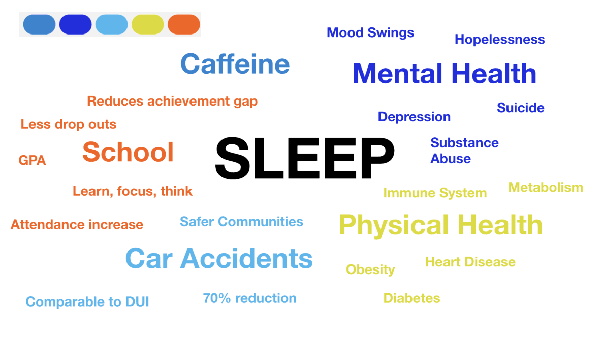
I used this to map out all of my thoughts and ideas about what directions this project could go into, and then grouped them by topic. It was nice to just dump all of my thoughts onto ‘paper’ and have them be more organized. This gave me ideas on what I could write about and how to divide up chapters.
Final Design Brief
My design brief changed a lot but regardless it definitely helped me ground my project and keep my end goals and audience in mind.
I have never made a design brief before but this will be something that I incorporate into my work flow for the future.
03 Design
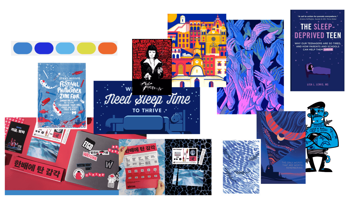
Collecting Visual Inspiration
Color palettes, text, graphic styles, you name it. It was interesting to see what I wanted to do initially versus where I ended up after countless testing of design choices.
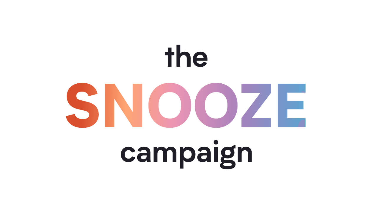
Logo
I wanted to keep this simple and legible, as that fits the purpose of the campaign and is easily searchable. I incorporated the gradient of the color palette into the logo to keep things fun and tie everything together.
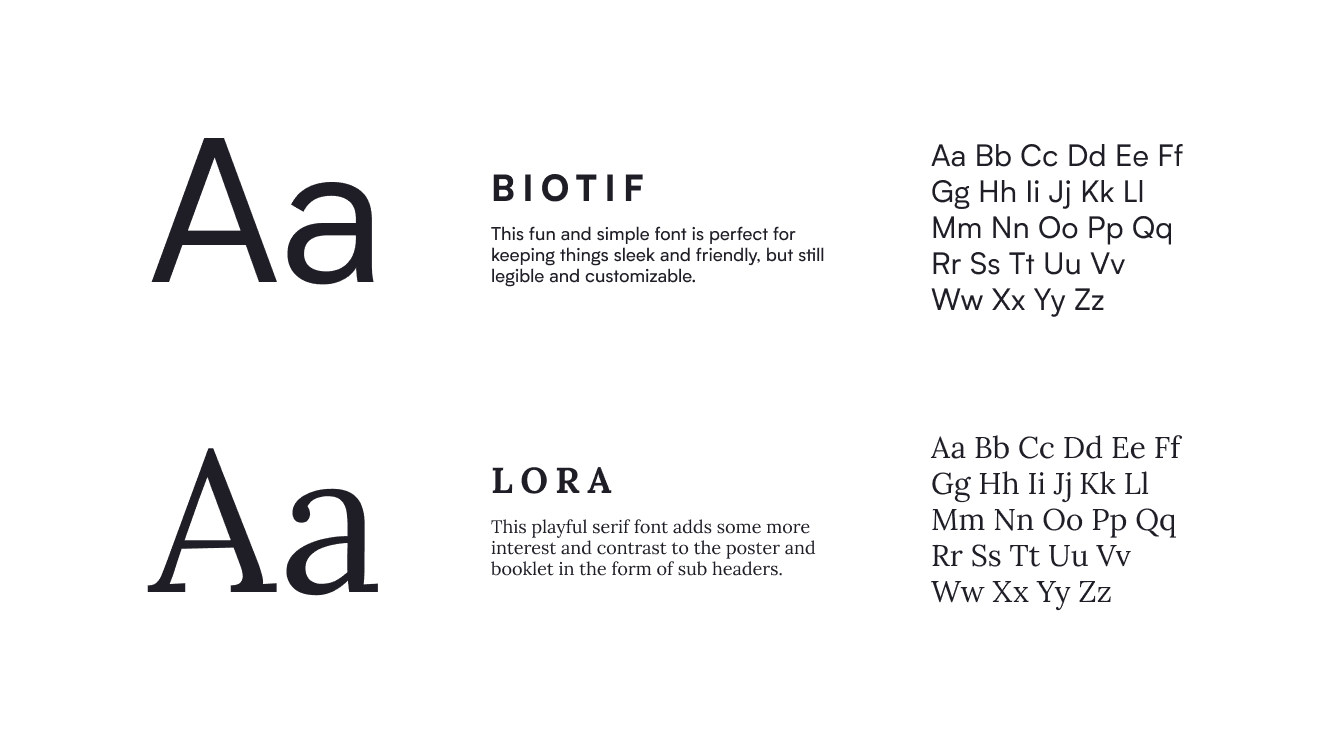
Typography
I was scrolling through Spotify’s website when I saw this gorgeous font Biotif being used and knew right then that it would be perfect for this project.
Color Palette
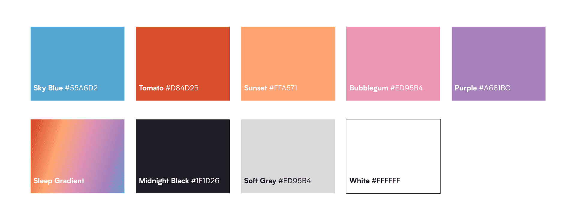
This color palette adds so much life and fun to the deliverables. It’s balanced and recognizable, and creates a beautiful gradient.
Cover Design
I was inspired by this Hermés book cover. I really liked the illustrations overlapping an empty shape, and decided to add my own spin on it.
Chapter Intro Page
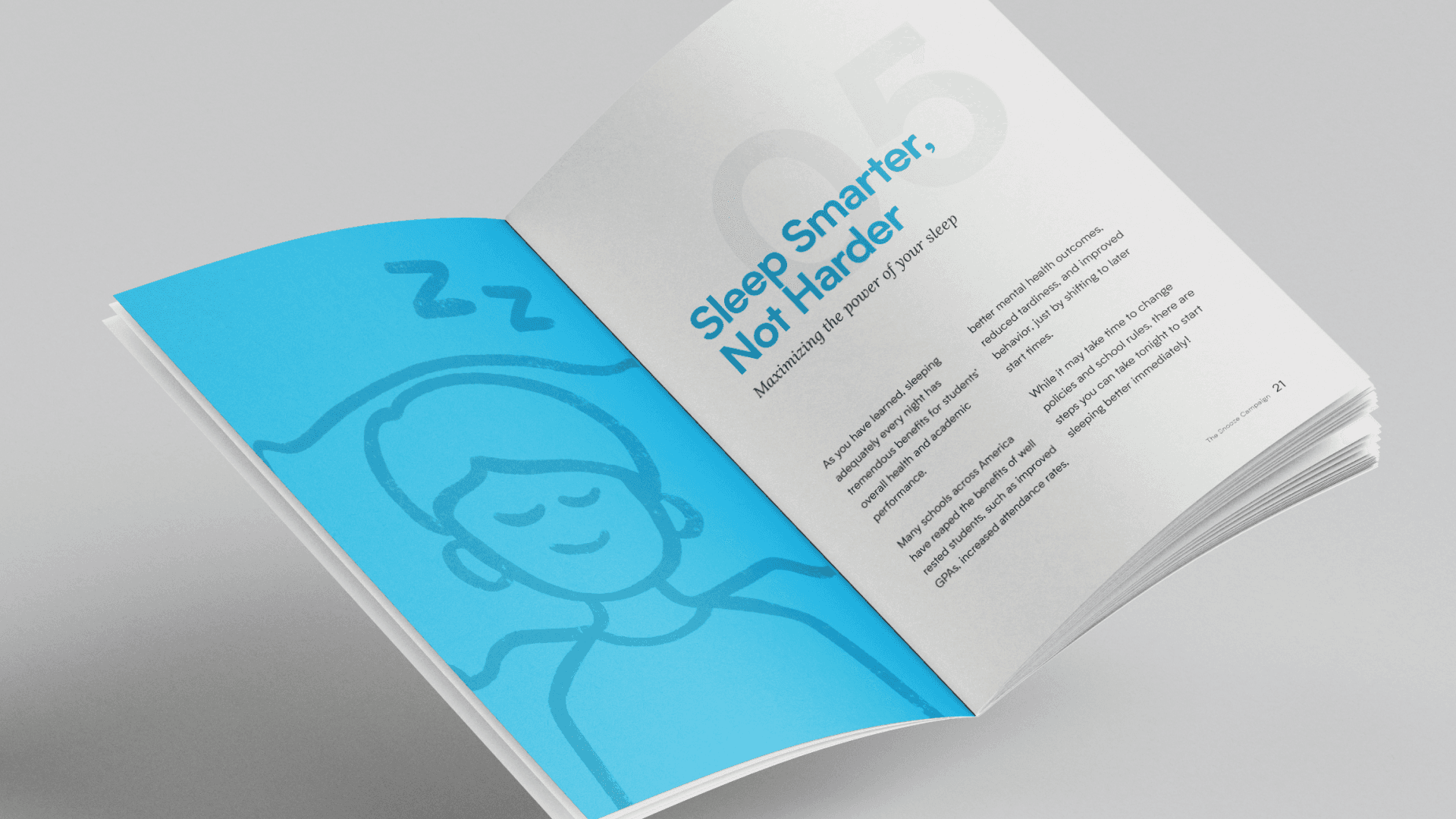
A full color page helps to visually break up the booklet and introduce a new chapter. The simple illustration style used here gives a quick overview on what the chapter will be about, without taking away attention from the text. I liked leaving half the page for just the title and chapter number, to give some white space and ease into the text.
04 Testing
Campaign Titles
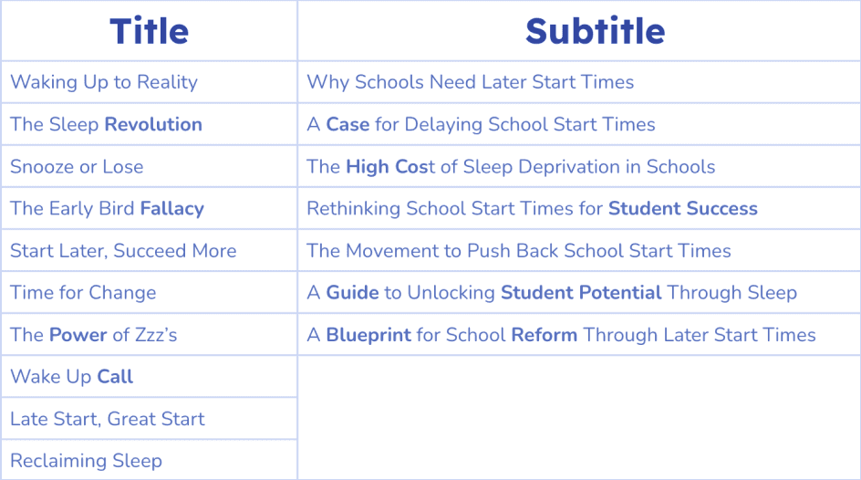
I came up with many different titles and pitched them to my professor, classmates, and friends to see what people thought. Eventually, I decided to stick with my original title of The Snooze Campaign, because it’s clear, effective, and memorable.
Book vs Pamphlet
I originally thought I would be creating a book, but after further consideration, it made sense to create a booklet instead. This way, its more easily distributable for teachers to hand out to students, and still short enough to have all the facts that students need to read without them feeling overwhelmed or bored.
Teenager vs Rooster: Poster Effectiveness
With this poster, I wanted to grab students attention with this strange imagery of a face off between a boy and a rooster. The main goal is to get across just how early students need to be waking up because of their school timings. After getting advice from my peers, I decided to stray away from the blue and instead go for a color that more intuitively represents waking up, like a sunset. I updated the subheader many times to get the look I was going for. I also had to decide between either having a stepped gradient, or a smooth one.
Dusk or Dawn Poster
With this poster I wanted to illustrate how dark it is when students are preparing for school, and how the time equivalent for an adult is even more ridiculous. With these posters, I mostly experimented with the colors, backgrounds, layout and typography.
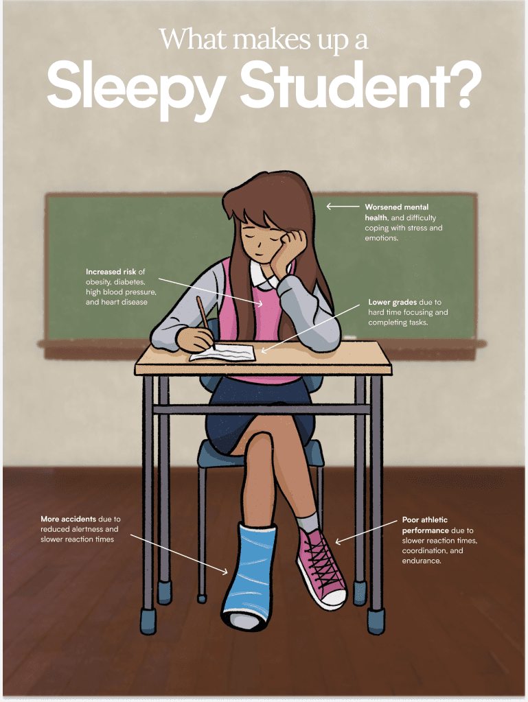
Sleepy Student Poster
This poster was initially inspired by anatomy posters that we often see in science classes. I wanted to illustrate how sleep deprivation effects our entire body. This poster underwent many changes as I further refined what I wanted it to look like. I strayed away from the skeleton in order to be more in line with the rest of my illustrations in my campaign.
Merchandise Ideation
I wanted to create merchandise that would be effective and related to my audience and the topic of sleep itself. I considered bumper stickers, normal stickers, a sleep mask, mug, etc.
05 Final Design
A. Booklet
Educational Booklet
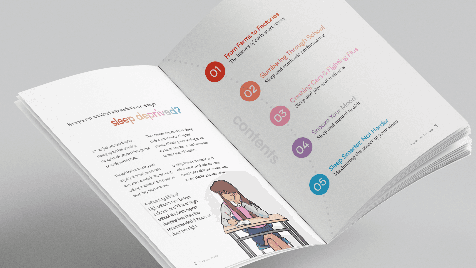
24 pages complete with a cover, introduction, table of contents, 5 chapters of text, and illustrations.
B. Posters
Educational Poster Set (3)
I designed three educational posters with the same visual styles and tone, for use in schools to remind students to prioritize their sleep.
C. Merchandise
Postcard
This was originally a poster design but the scale was better suited for a postcard, so I went that route. I wanted to create a postcard design so that people could share these easily whilst sharing the message as well.
Stickers
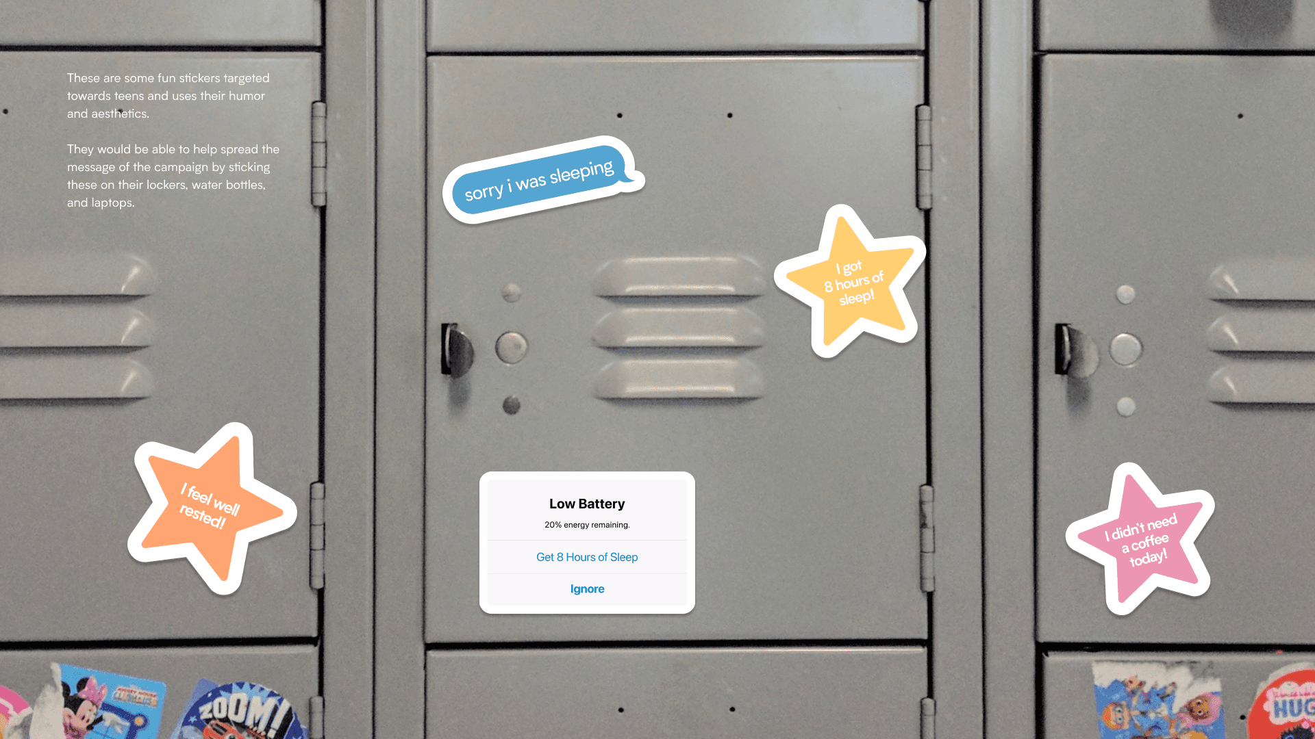
These are some fun stickers targeted towards teens and uses their humor and aesthetics. They would be able to help spread the message of the campaign by sticking these on their lockers, water bottles, and laptops.
Journal
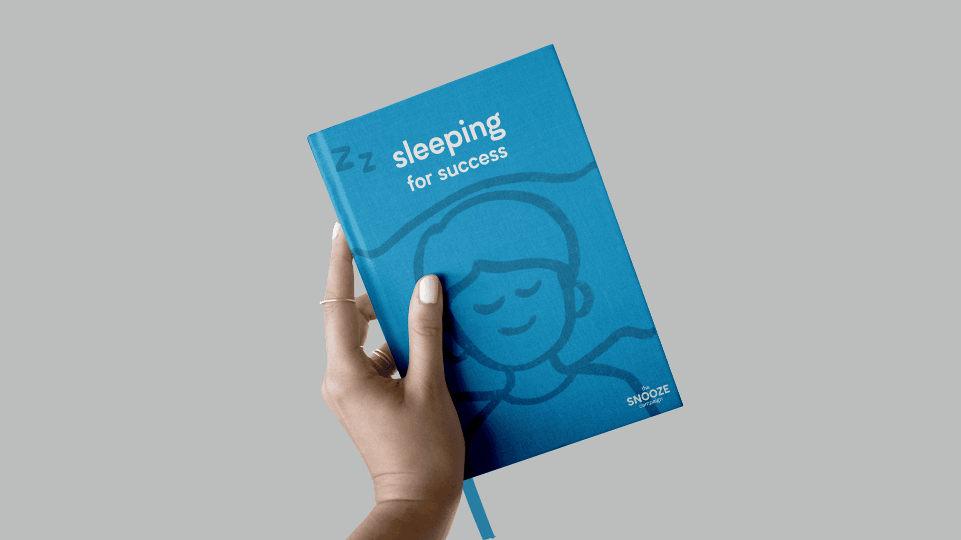
This sleep journal was designed to be a place where people could log their late night thoughts, track how much they’re sleeping, and create a healthy night time routine of avoiding screen time. I know many apps exist with a similar goal, but they encourage people to be on their phones at bed time which ultimately makes it harder to fall asleep due to the blue light emitted by electronics. This could also be part of my future work, where I could hash out what exactly what is needed in such a journal.
06 Reflections
Measuring Success
The success of this project has been a true achievement. I was able to bring my original vision to life while gaining valuable knowledge and skills throughout the process. Choosing the topic of sleep deprivation, especially regarding teens and school schedules, was a personal passion of mine, and I am thrilled to have been able to create accessible and engaging resources to promote good sleep hygiene.
This project was received well in our final class review, where we presented our projects to a board of designers as well as our classmates. Peers had great questions about the workflow, were interested in the research, and agreed that the cause was an important one. the I earned an A in the class.
Design Skills
Through this project, I honed my design skills and expanded my knowledge of various design tools, including Figma, InDesign, and Procreate. In particular, I gained learned how to design for print, which was a new and exciting challenge for me. I also made it a priority to create designs with my audience in mind, learning how to adapt my work to suit different demographics and better meet their needs.
What I Learned
Finally, collaboration was a key factor in my success. Regularly sharing my progress and getting feedback from my peers proved to be an incredibly beneficial practice. By bringing visuals and hard copies to our critiques, I was able to get into the details of my designs and get everyone’s thoughts. I learned how to ask the right questions to the group to hear what I needed in order to push my work forward. Equally important was the ability to listen to and learn from my fellow designers. Seeing them overcome challenges in their own work inspired me and provided fresh perspectives on how to approach my own design challenges.
