Colleges in Boston
Boston is one of the country’s biggest college towns, and in this stretch of land alone there are 13 different colleges.
Using data visualization techniques, we were able to encode lots of different information into one map.
Encoded data:
Acceptance rate
Graduation rate
Year established
Official logo
Average tuition cost
Undergraduate student population
Location
Tree Conditions in Commonwealth Ave
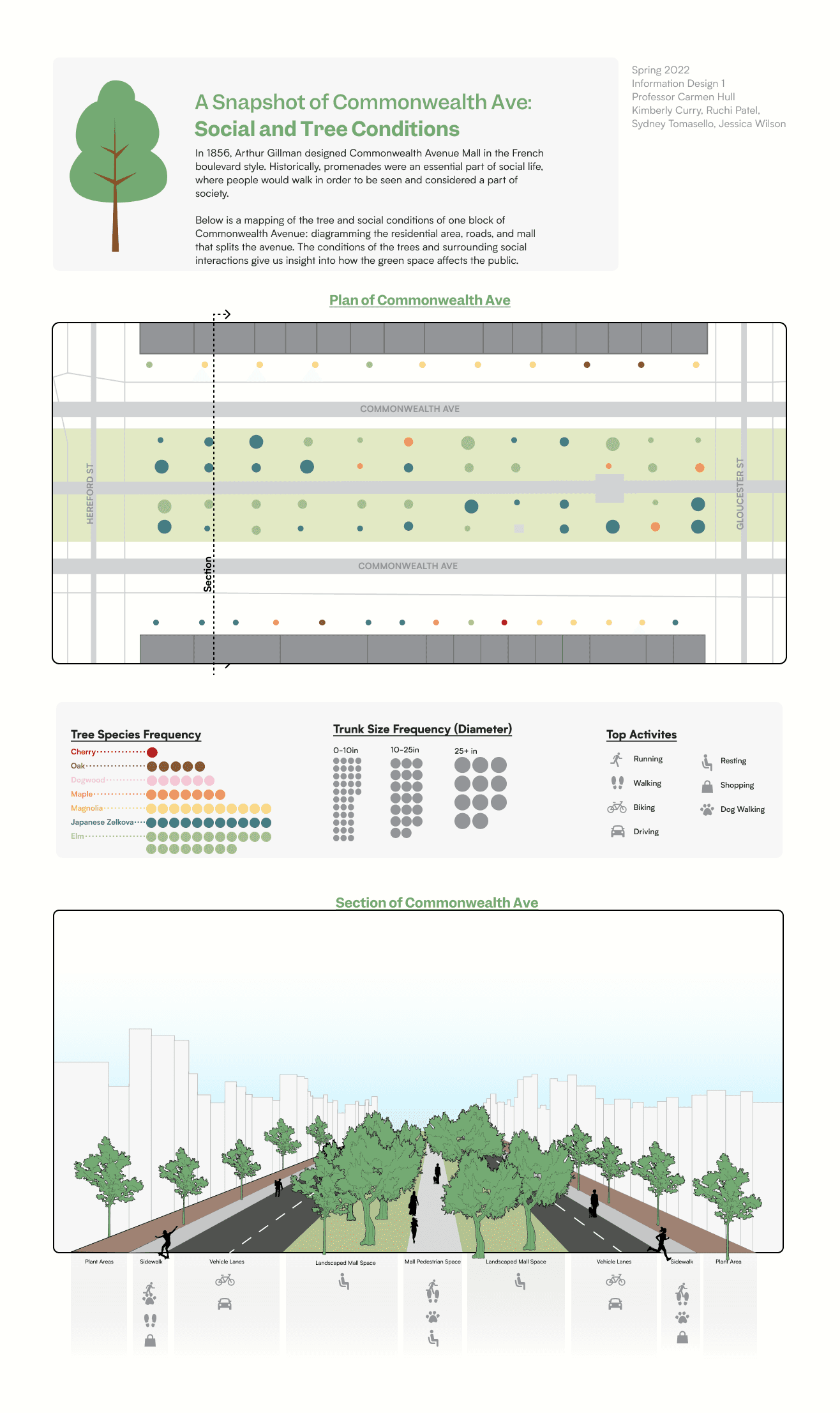
The Commonwealth Avenue Mall is a vital public space that serves as a hub for exercise, recreation, and social interaction, connecting Back Bay with the Boston Common.
Our project explores how green spaces transform communities and foster social activities through data visualization.
We mapped social and tree conditions on one block, detailing residential areas, roads, and the mall. Tree data included species, trunk diameter, and location, while social data covered space usage.
The design uses intuitive colors and shapes for easy understanding. We highlighted the social and environmental significance of the mall, ultimately illustrating the broader impact of urban green spaces.
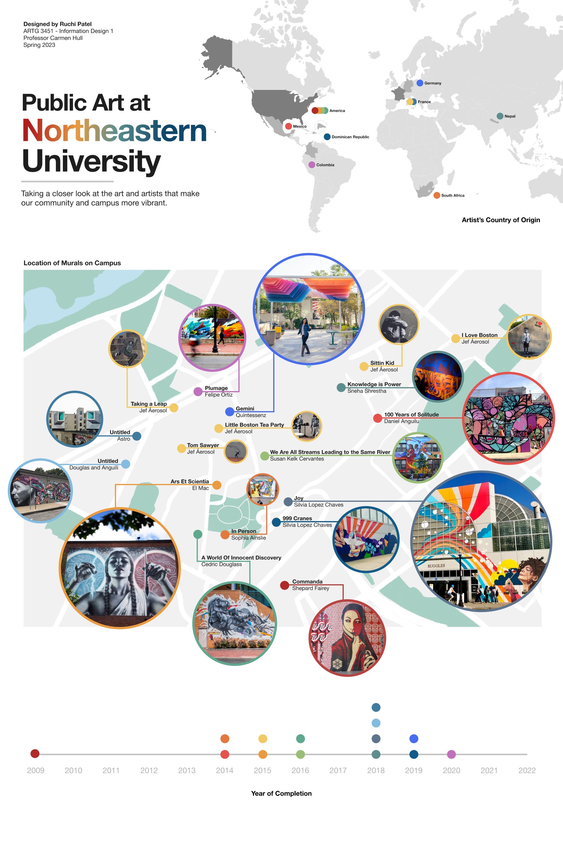
Murals on the Northeastern University Campus
This map explores the murals on Northeastern’s campus, the artists who have created them, the dates they were created, and much more inferred data.
How to read:
Each color of a dot represents a single artist.
On the world map, find where the artist is from.
On the campus map, the dot tells you the name of the artist and title of their works.
The size of the photos represent their popularity on campus.
The timeline shows when the mural was completed.
Example: American artist Shepard Fairey's Commanda was completed in 2009.

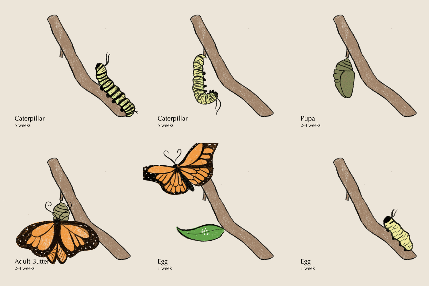
The Butterfly Metamorphosis Cycle
Animations have the ability to share a lot more information than still images can.
I have hand drawn a GIF that investigates the power of transformation in communicating the structure of an idea or system, in this case, a butterfly's life cycle.
You can simply and visually understand the process of how a caterpillar becomes a butterfly, as well as the stages that occur and the duration of those stages.


