Background
Couplet is an innovative dating app founded by Victoria and Jan, based in Boston. Victoria, a nonprofit research and consulting professional, saw a common challenge faced by arts and culture organizations—the struggle to engage younger and more diverse audiences. Jan, a software engineer, recommended a partnership with our team to bring the initial app idea to life.
When the client approached us, Couplet was in the conceptual stage, requiring us to build the application from scratch. Our goal was to create an intuitive user experience while establishing a scalable foundation for future development

Why Couplet?
While traditional dating apps and event directories exist—such as Joyraft, Hinge, DUO, S'more, ArtsBoston, and The Boston Calendar—none of them fully integrate dating with event-based interactions. Couplet differentiates itself by blending event discovery with a swiping mechanism that prioritizes shared interests over superficial attraction. Unlike Meetup or Eventbrite, which focus solely on event discovery, Couplet encourages meaningful connections by bringing like-minded individuals together at real-life events.
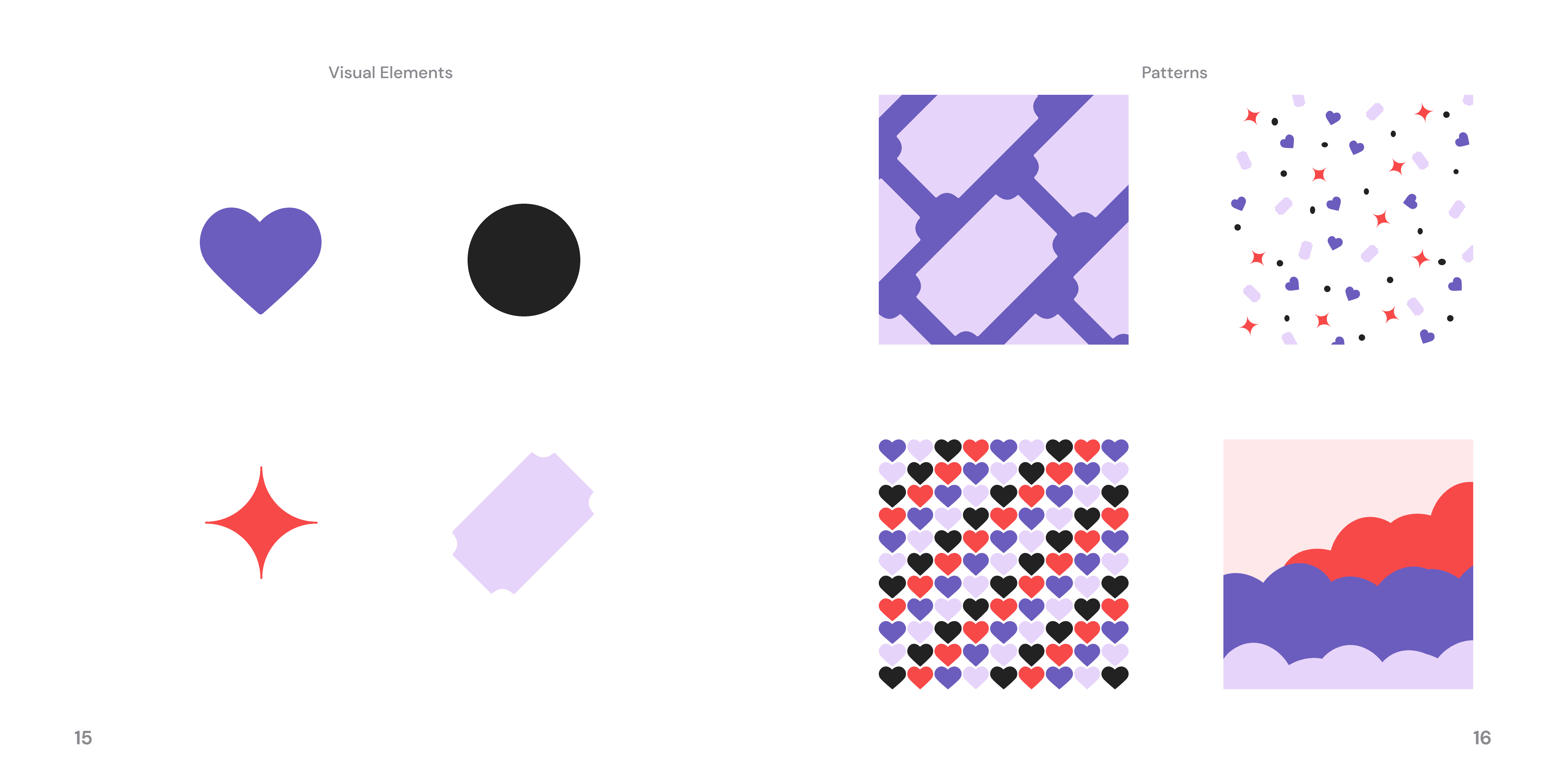
The Brand Book
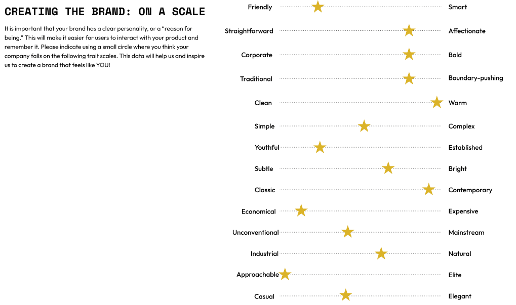
I organized and structured the brand book, guiding the design team in presenting branding elements in a visually cohesive and informative way.
UX Research & Insights: What’s Missing in Dating Apps?
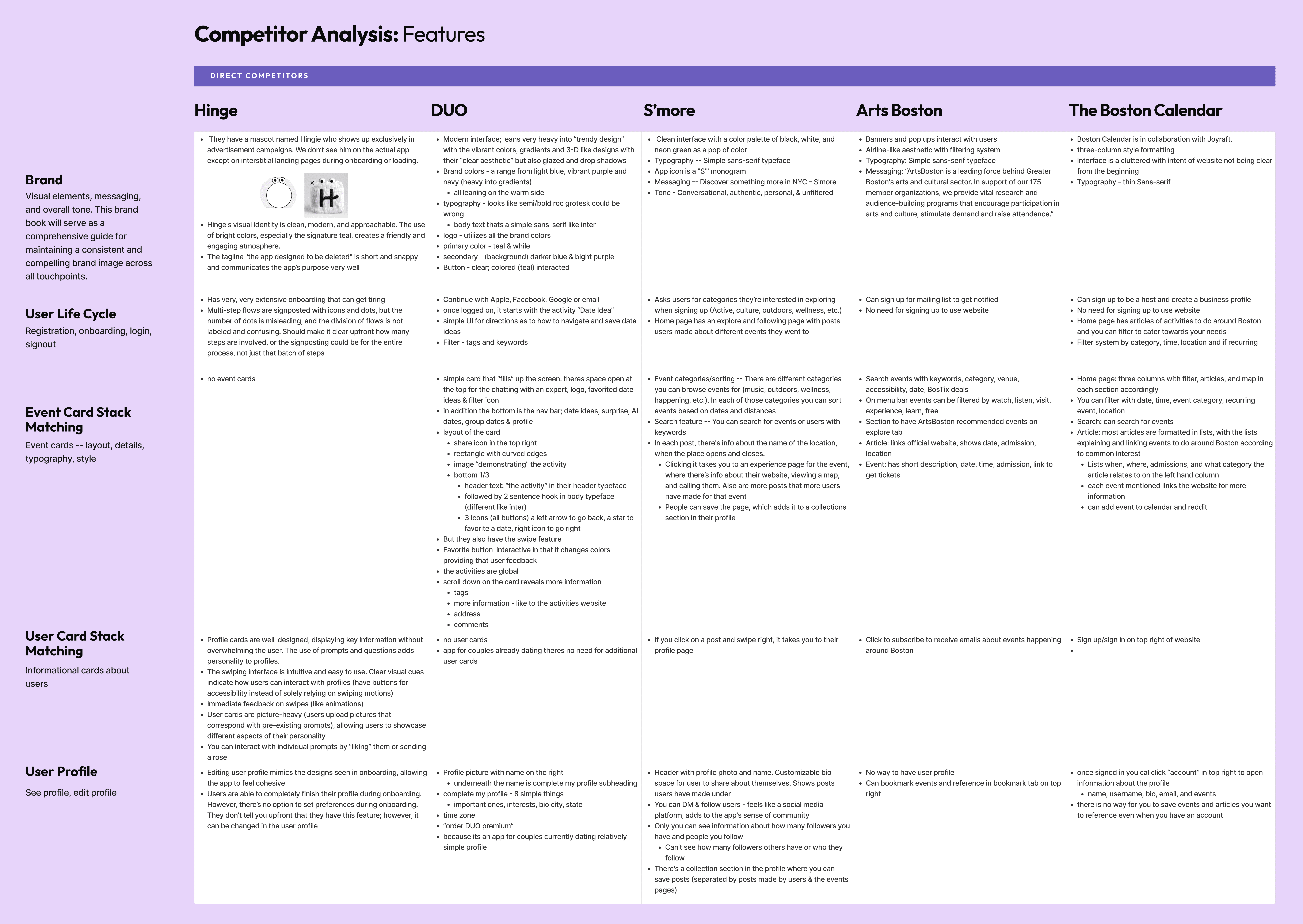
Competitor Analysis: I led a competitor analysis where each designer examined a dating or event-based app, documenting its features and usability strengths. This helped us understand user expectations and gaps in the current market, allowing us to refine Couplet’s unique value proposition.
Proposed Solution: Traditional dating apps prioritize superficial interactions, leading to unsatisfactory user experiences. Additionally, local cultural events struggle with visibility and engagement. Couplet addresses both issues by connecting people through shared interests in events by integrating event data from sources like ArtsBoston.
My Role: Leading the Team in Design
Project Timeline and Task Delegation: As Design Lead, I developed a structured project timeline, ensuring our team met deadlines for research, wireframing, prototyping, and final design handoff. I assigned tasks based on each designer’s strengths and areas of interest, fostering a collaborative and efficient workflow.
Key App Criteria:
Seamless Onboarding: A streamlined registration process that allows users to easily set up profiles and define preferences.
Event Discovery: Intuitive tools for finding and RSVPing to events based on interests, location, and availability.
Personalized Matching: Algorithms that prioritize connections between users attending the same events.
Engaging Communication: Messaging features designed to encourage meaningful conversations and connections.
Feedback & Iteration: Continuous user feedback loops to improve UX and refine the app over time.
Moodboard, Typography, Logos, and Colors
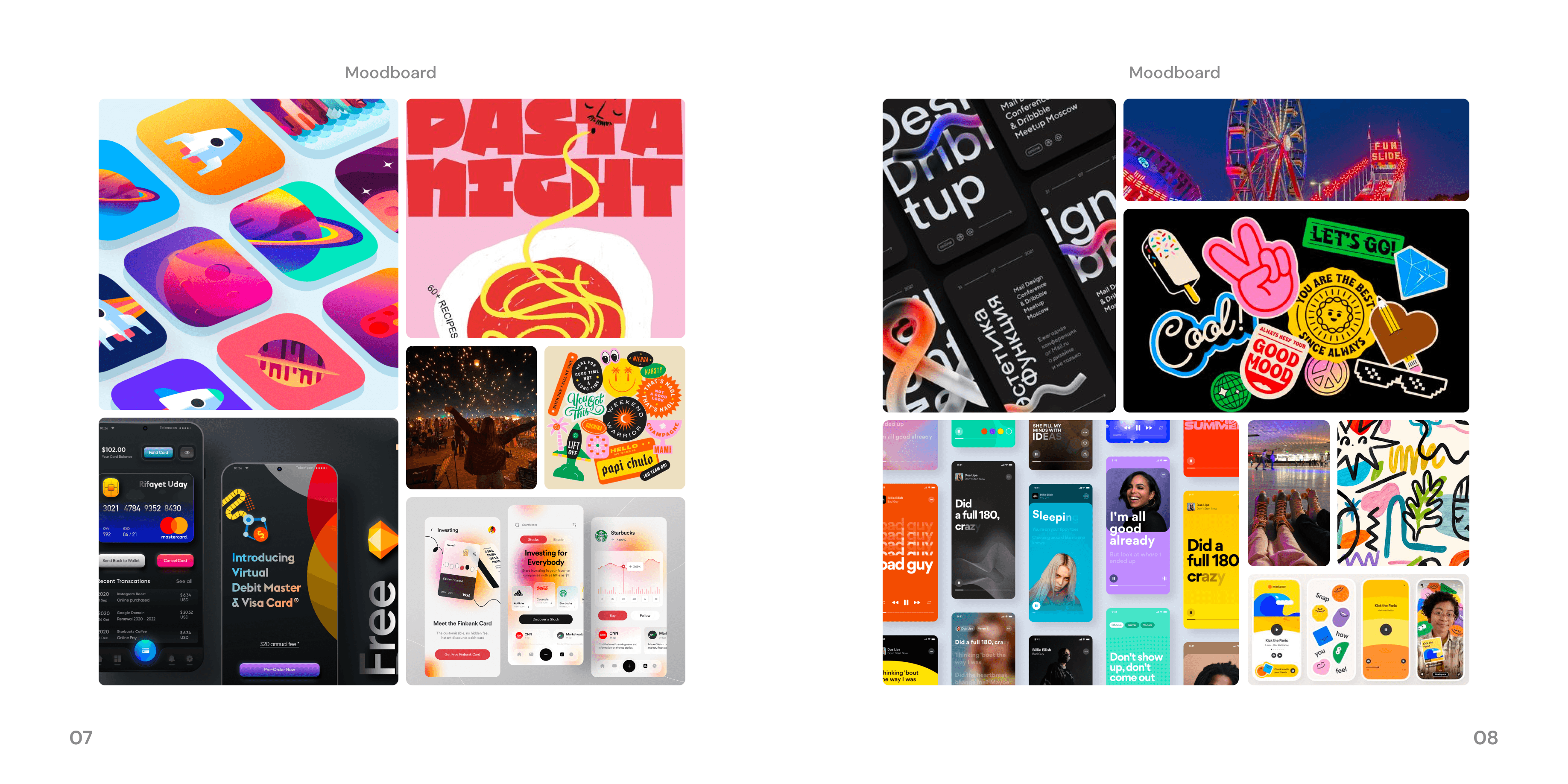
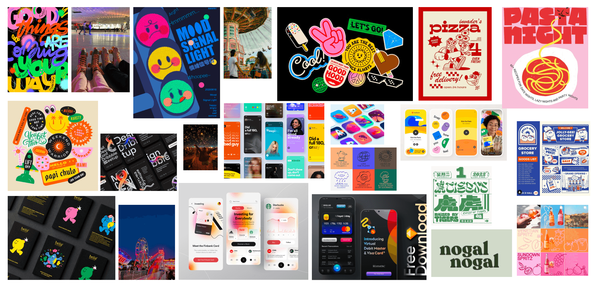
Moodboard: Creating a moodboard was vital in learning what direction to take our project in. We wanted our app to be fun and inviting for everyone to try out, but still be able to stand out against competitors. We created a moodboard with a focus on bright colors, bold text, gradients, and fluid shapes.
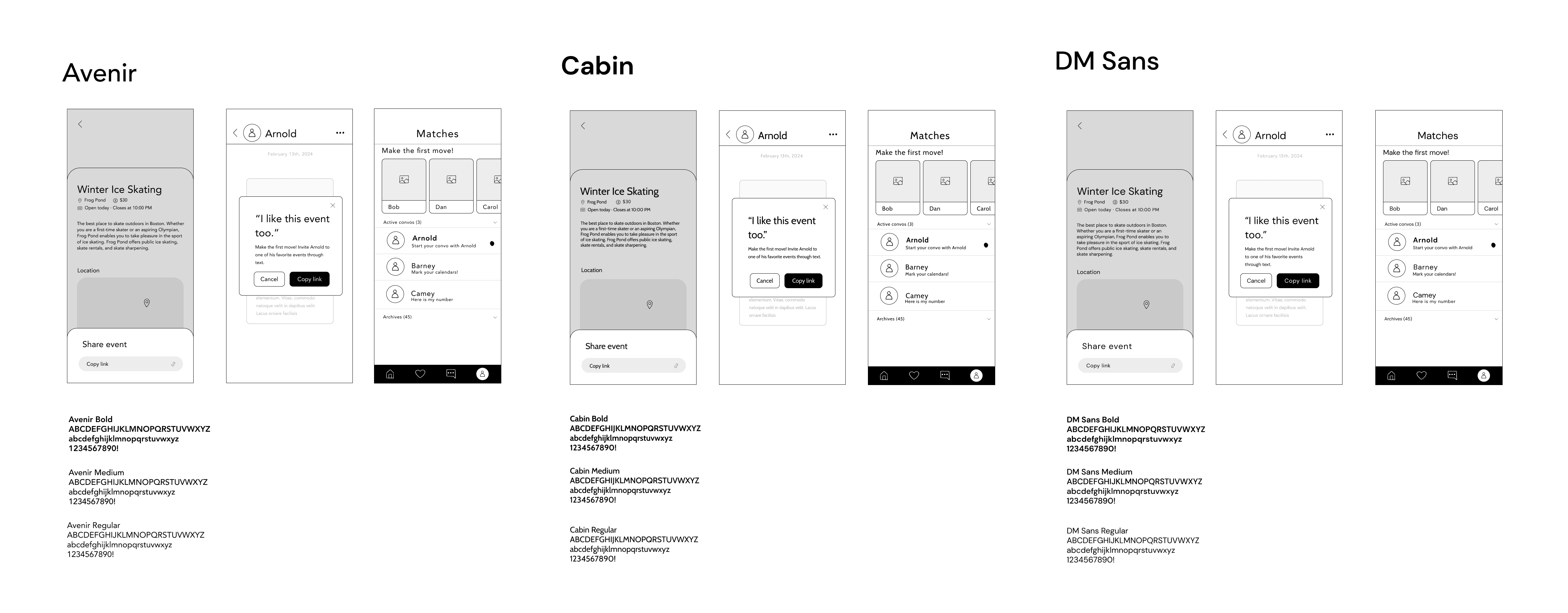
- Typography: After trying out many different fonts, we were down to three to choose between. During our all hands check in, we tested out which font performed best. We showed the fonts in use across three different lofi wireframe screens, and then
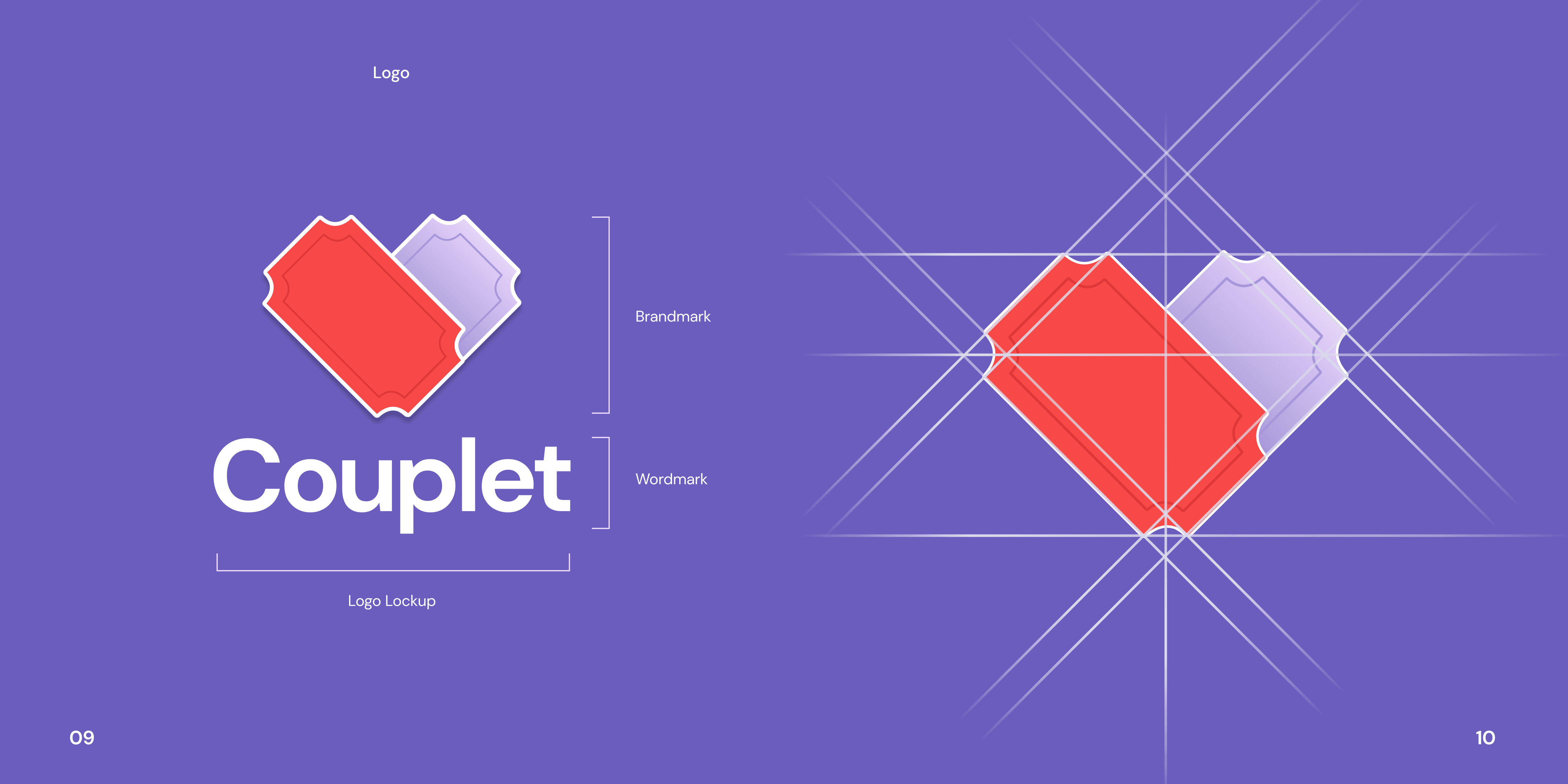
- Logo Exploration: Users resonated with a design featuring tickets forming a heart, symbolizing both event participation and matchmaking.
- Color Testing: Softer tones performed best, with users advising against green (too financial) and yellow (too similar to Hinge).
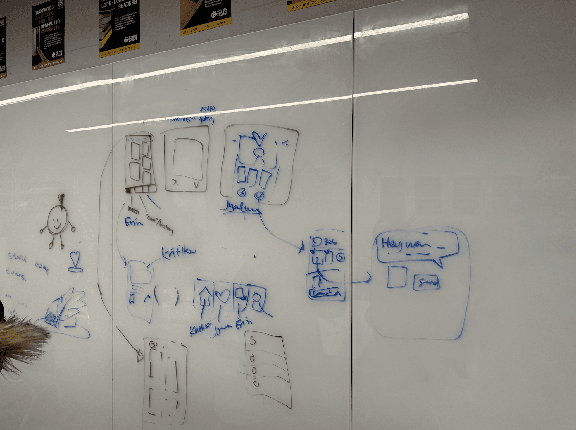
Lo-Fi Wireframes
Profile Creation Flow: Setting up a dating profile can be time-consuming, often discouraging new users. To streamline onboarding, we incorporated:
A progress bar to indicate completion status.
Engaging visuals to make the process enjoyable.
Combined steps where possible to reduce cognitive load.
Selectable chips for hobbies and interests to make entry quicker
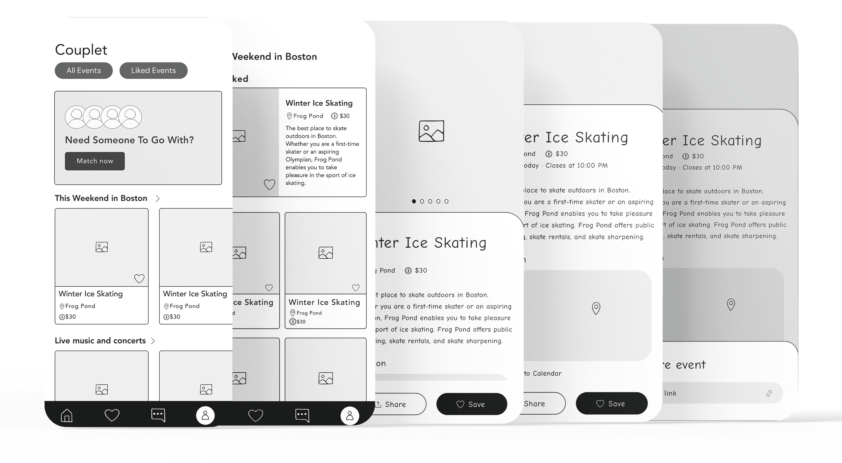
- Event Discovery Flow: Our home screen helps users explore and RSVP to events that align with their interests and schedules. By integrating social elements, users can see who else is attending and connect in a low-pressure setting.
- Filters to narrow options based on preferences, location, availability, and type of event.
- Rows to browse through: trending, music, arts, sports, etc
- A rotating, blurred image of potential matches not only piques curiosity but also encourages users to swipe on profiles, tying in the matchmaking component with event discovery.
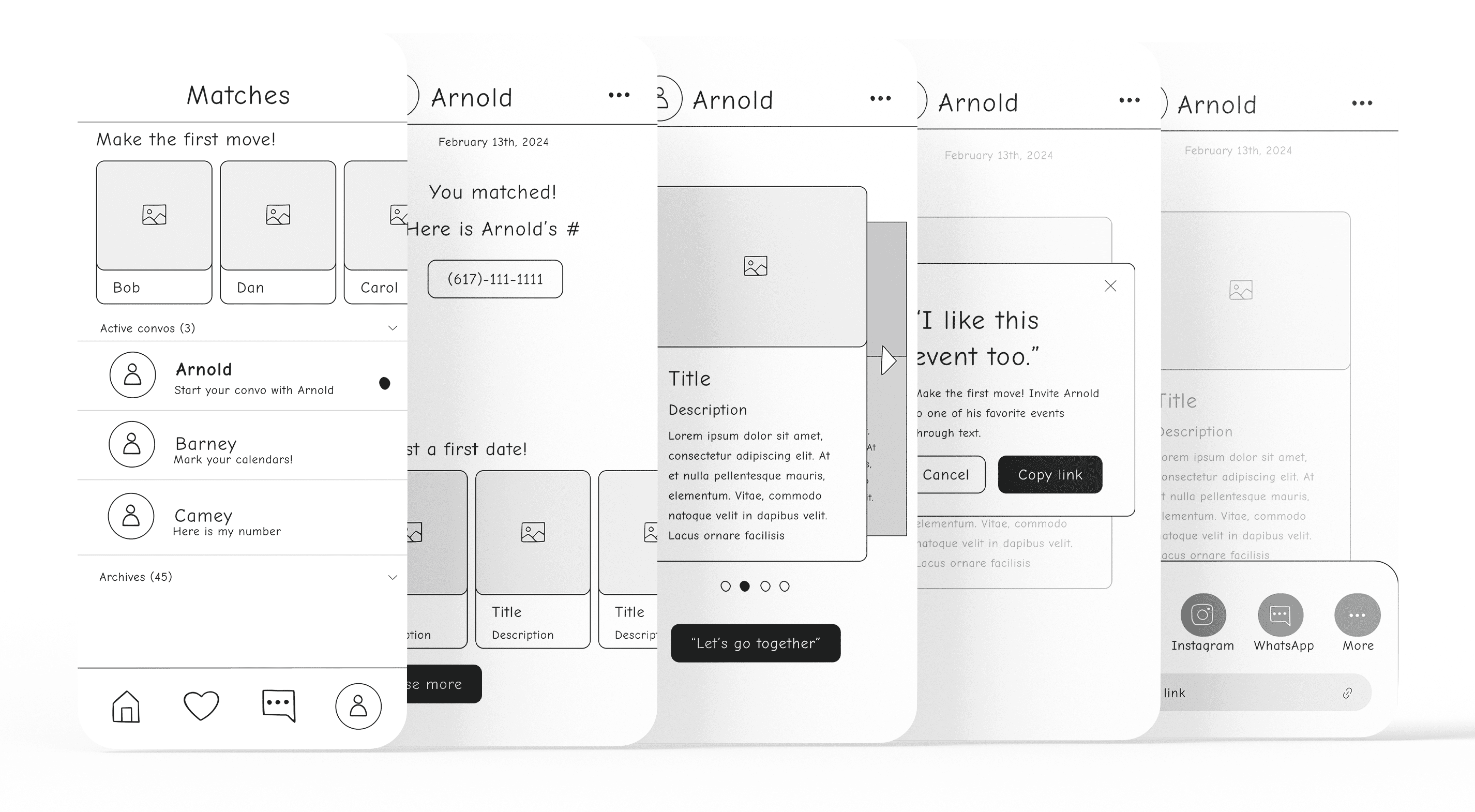
- Matchmaking Flow: This flow is aimed at helping users connect and plan real-world interactions based on shared interests, without relying on direct messaging (due to engineering constraints).
- Instagram Exchange: When two users match, their Instagram handles are exchanged, giving them a way to stay connected outside of the app. This builds a sense of continuity and personal engagement.
- Shared Event Interests: To further enhance the connection, the app also shows users any events they both like or have in common, making it easier for them to plan their date around something they both enjoy.
- The workaround of exchanging Instagram handles while keeping event discovery at the forefront is a clever way to encourage connections and streamline the user experience.
Final Design
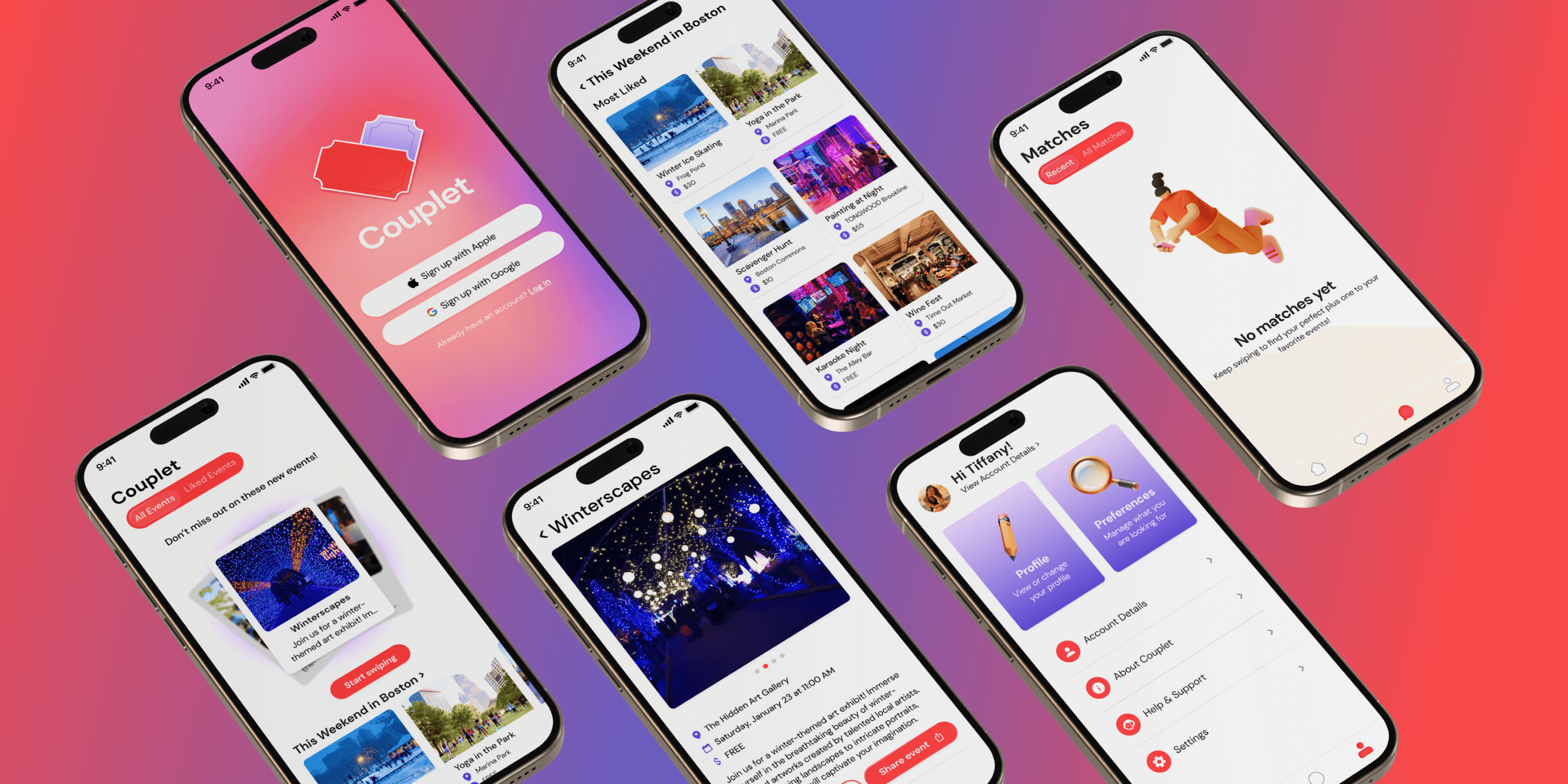
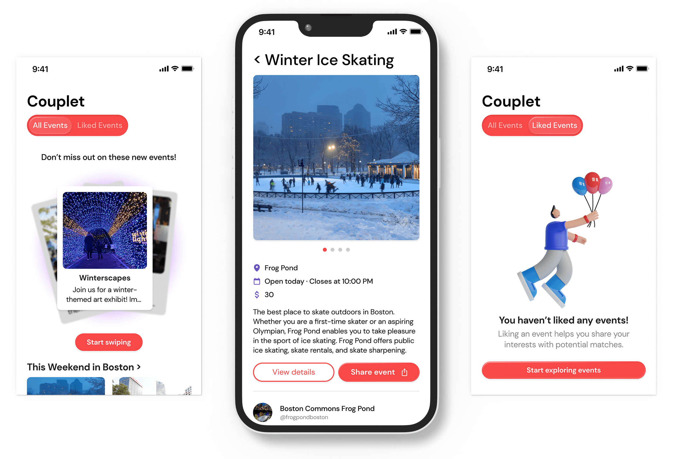
- For each event, an image and its cost, name, and location are displayed.
- Events can be liked/disliked by clicking on them from the home page or using the start swiping button.
- There is a slider to display liked events so the user can view what events they’ve already liked.
- When users click on an event to start liking/disliking it, they are presented with a more detailed event view.
- The user can view details and be linked to the event website to get more information or share the event.
- The user can like/dislike the event to be shown another event or tap the left caret in the top left to return to the home screen.
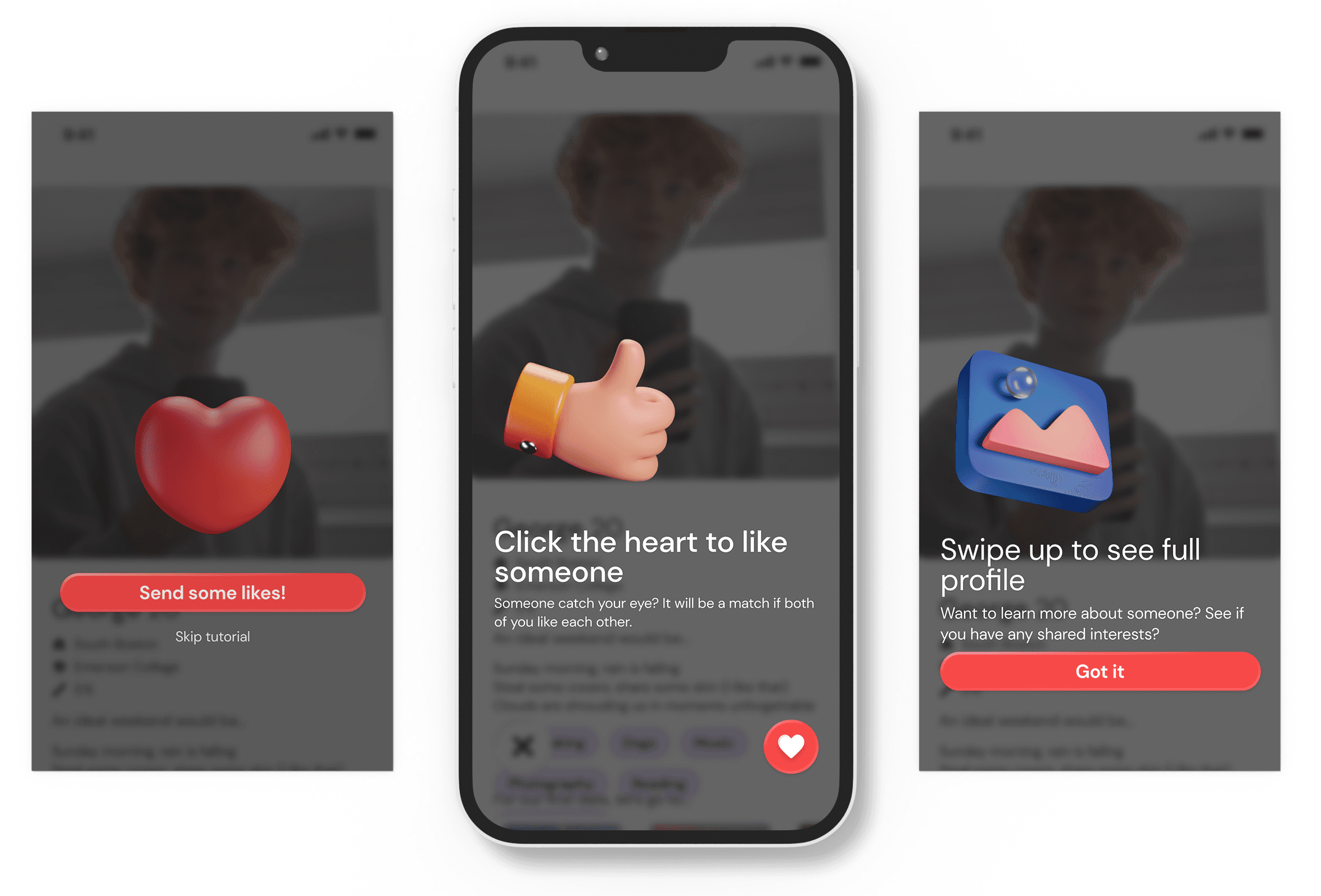
- Similar to events, users can like/dislike other profiles based on the information they display.
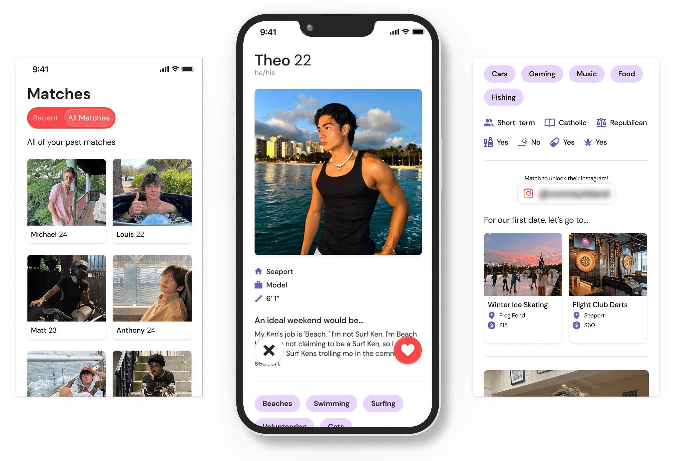
- Mutually liked events are displayed on each user’s profile
- Their Instagram handles are blurred out to protect their privacy
- The matches page has a switch at the top left to select whether to view recent matches (the past seven days) or all matches.
- Each match shows their main image and their name.When you select a match, their complete profile is shown again but without their Instagram handle displayed
- The profile page displays various demographic information
- It also shows users’ images, and they can insert their captions for each image to showcase their personality
- There’s a switch at the top of the screen to select whether to view/edit your profile.
- All profile information is customizable after onboarding, including pictures/captions besides name and age.

Measuring Success
Generate Showcase 2024: Our showcase was the final presentation of our work from the term, with over 300 attendees. We had an amazing turnout and everyone was very excited to see all of our progress that Couplet had made. I am so grateful to have had the chance to work on such a fun and meaningful project. I am also proud of my design team and how far they have come!


